Netflix
Internal design systems and business tooling
- Role
- Year
- Summary
- As part of Netflix's Core Foundations team, I worked on design systems for user messaging and feedback. I also designed internal tools to drive innovation in how the business tracks and leverages proprietary information.
Making Netflix emails feel like the stories inside them
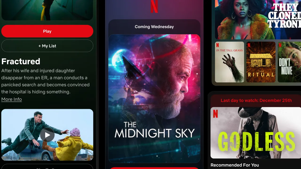
Redesigning emails wasn’t the part of working at Netflix I expected to get excited about. What drew me in was a question: could an email take on the personality of the story inside it, automatically?
Netflix already personalized artwork to members’ interests. I saw an opportunity to let that artwork shape the surrounding email, giving each message its own atmosphere without designing every one by hand. The challenge was making that expression work within a reusable system—and survive the constraints of email.
I worked on the library and system guidance, and partnered with contract designer Rob Bigwood on the visual redesign. My contributions included proposing artwork-based theming and building a working prototype to help the team evaluate it.
My first experiment was rough. I blurred artwork in Figma, picked a dominant color, and placed a gradient behind the original image. It gave us enough to begin exploring.
Rob and I tested layouts, artwork treatments, and headline arrangements around that direction. I pushed for more variations to understand where the idea held up. We also explored extending the palette to buttons and headlines, while keeping the simpler needs of account messages in view.
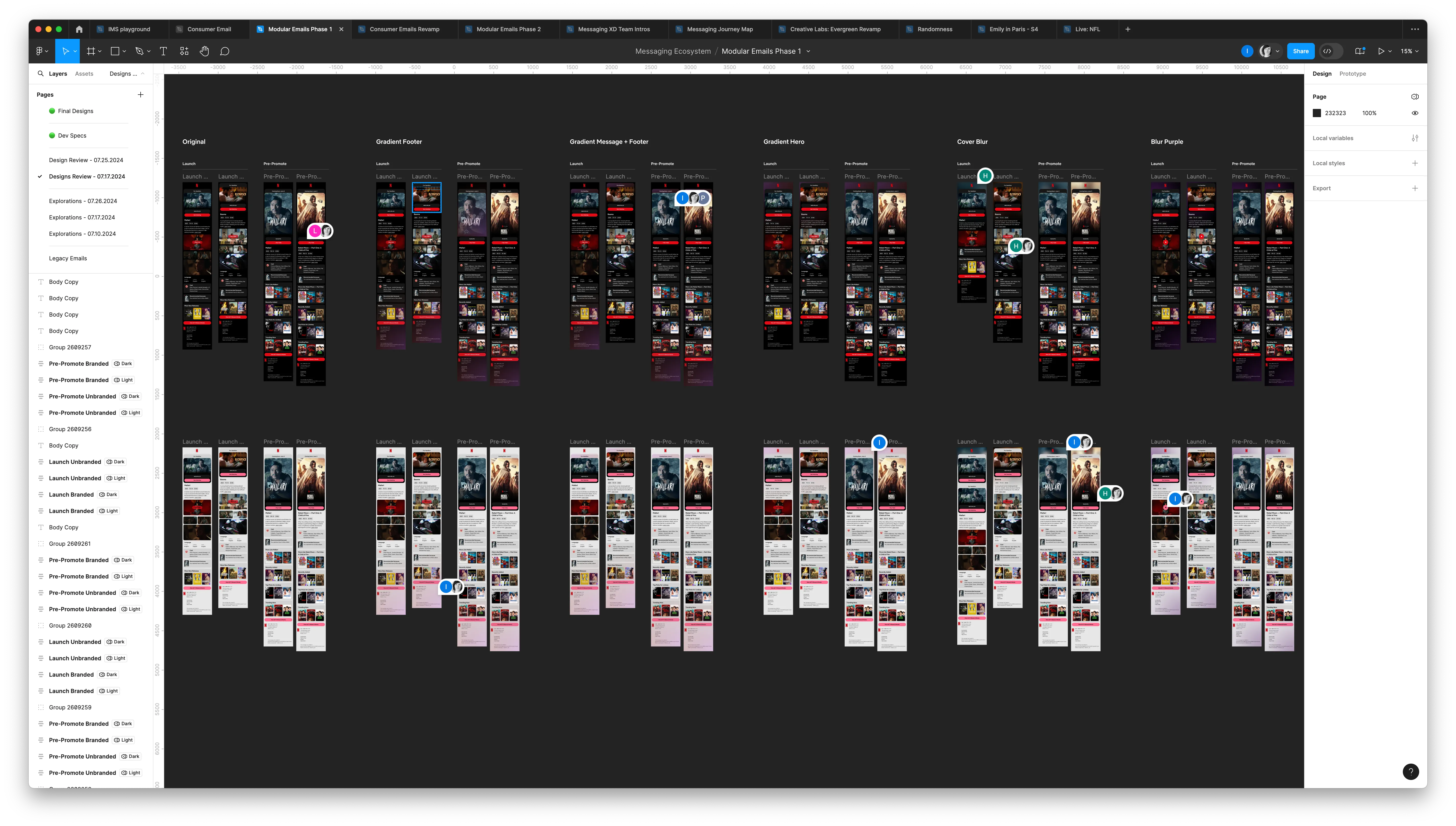
Exploring gradient placement and artwork treatments across light and dark layouts.
Giving the team something to test
Engineers were initially skeptical. They weren’t sure how the thematic approach could work reliably and wanted something more straightforward to test.
I had worked with email earlier in my career and believed we could find a practical approach. I built a small tool from scratch in HTML, CSS, and JavaScript that extracted colors from artwork. Existing color-extraction tools helped inform it. My contribution was applying the technique to our problem and making it tangible for the team.
I brought the extracted colors into Figma alongside the original images. When a result felt harsh or muddy, we adjusted the selection logic and tried again. This gave us a way to evaluate the idea against real artwork instead of relying on combinations chosen to make a mockup look good.
I also helped prototype layouts in HTML and CSS to explore responsiveness and dark-mode behavior. These were working experiments. Our engineers owned the production implementation within Netflix’s messaging infrastructure.
We kept them involved as the designs developed. With realistic examples in front of us, we could discuss where the approach worked, where it broke, and what needed to change. I felt their enthusiasm grow as the idea became more concrete.
Making expression work within constraints
The details became more demanding as we explored. A background could complement the artwork and still compete with the message. Dark mode raised questions about color inversion, while differences between email clients complicated the rendering.
We tested how the gradient faded into light and dark backgrounds, checking it with both black and white text. We adjusted its extent so the body copy had a calmer background. For small banners over the themed area, we explored translucent contrasting backgrounds to keep the words distinct.
The goal was to let the artwork set the mood while leaving the message easy to read.
I shared iterations with stakeholders, highlighted a recommended direction, and showed the examples behind that recommendation. Showing where a design struggled helped explain the decisions as much as showing where it worked.
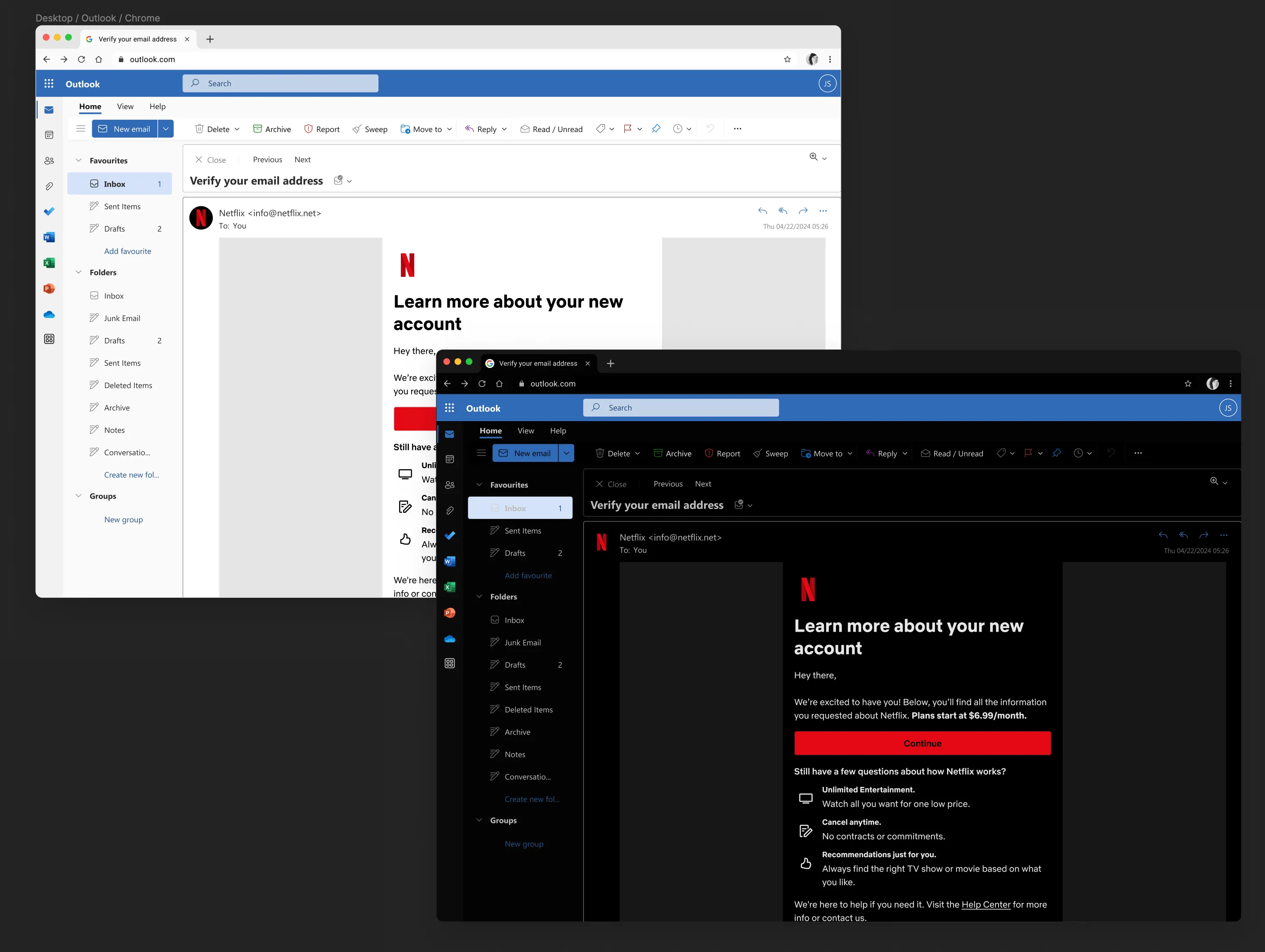
Light and dark treatments for an account email, shown in Outlook in Chrome.
Building a resource other designers could use
Alongside the visual work, I wrote a design strategy memo outlining what the system needed: reusable components, complete templates, corresponding engineering components, and guidance for using and testing them. Designers elsewhere in the company were already asking for the email library. That demand gave the foundational work a concrete purpose.
The completed Figma library brought together typography, spacing, button styles drawn from Hawkins, artwork treatments, illustration guidance, and full layouts. Gallery components supported different numbers and arrangements of titles. Designers could assemble an email and explore alternatives without rebuilding its foundations.
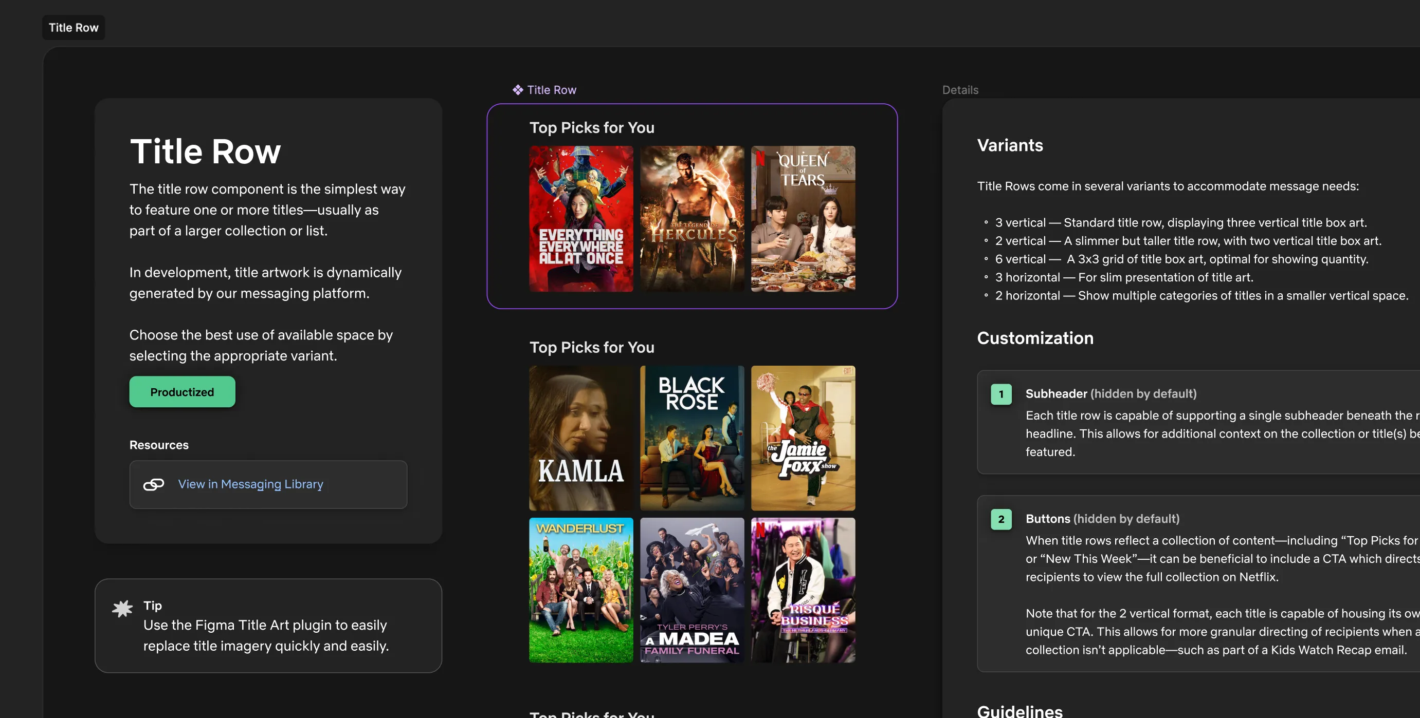
The Title Row component pairs reusable artwork arrangements with guidance on variants and customization.
The thematic treatment became part of that larger vocabulary. It gave content-focused emails room for expression while shared components kept the system coherent.
Early, specially built emails provided opportunities to refine the direction. One announced Bridgerton season three. Another designer added a textured background reminiscent of wallpaper from the show’s world. Those early sends also informed further adjustments to typography and dark mode.
What I could point to
By the time I left Netflix, we had completed the Figma library and engineers were implementing the emails. I did not see customer results firsthand.
What made the project rewarding was the connection between the initial idea and the practical work needed to support it. I could contribute through visual exploration, system design, and code, while working closely with a designer who brought substantial craft of his own.
The project reinforced an approach I value: bring people into the work while it is taking shape, make a clear recommendation, and give them realistic examples they can evaluate. The result was a library designed to help other designers carry that work forward.