Prompts
A writing app with built-in inspiration
- Role
- Year
- Summary
- How might technology help writers be more inspired? What would happen if the same app a writer uses to capture notes or write content was also capable of providing suggestions, or prompts, as they write?
In 2013 I was Director of Content Strategy. The job was writing and managing people who wrote.
Anyone who has ever written anything will tell you that writing is hard. My team said so constantly, and two of their complaints stuck with me because I heard them repeatedly:
“Getting stuck is my problem. I never know what to do after that first line.”
“I can write, but only if someone has explicitly told me what to write about.”
I carried those two points around for a year before I began to see them as anything other than one framing of the same problem. I began to see them as two moments in time, and almost every writing tool I could find answered one and ignored the other. That’s where the idea for Prompts began.
Looking at what already existed
I wanted to build something that could authentically help writers overcome writers block. I started by conducting a competitive and comparative audit. The market sorted writing apps into two generic groups:
First: well-made tools for serious writing. Apps like iA Writer. Powerful, considered, respectful of the work. These apps assumed you already knew what you were going to say and needed a clean tool to help you do it.
Second: writing inspiration apps. Things like Grammarly and other prompt-a-day idea generators. These apps help you begin writing and then abandoned you at the moment you actually get stuck.
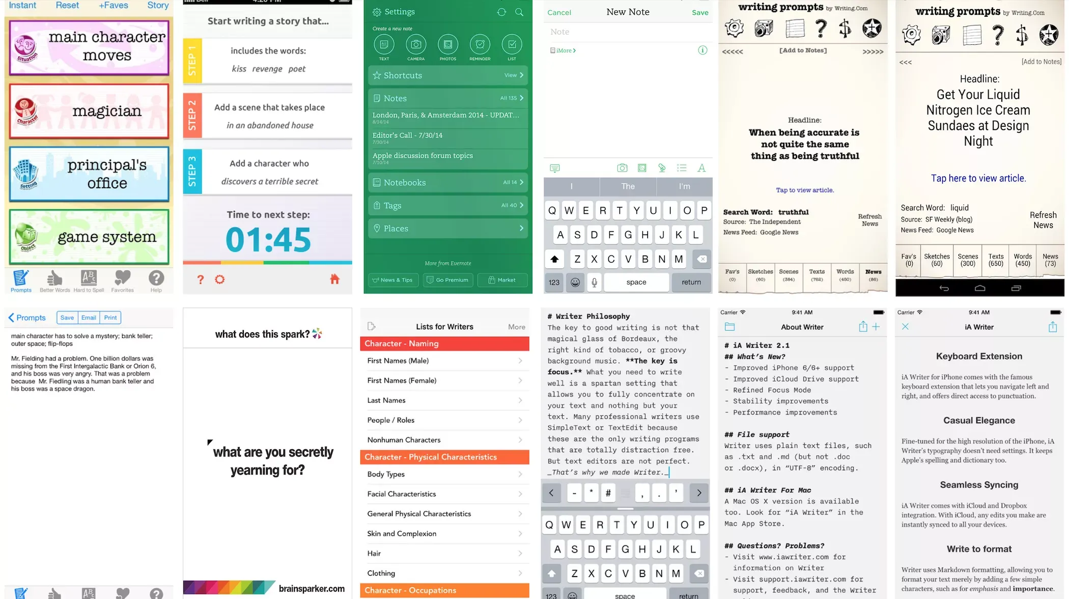
At the time, no writing apps sat in the middle. Nothing combined a real, thoughtful writing environment with help that stayed present while you worked.
Around this time I started paying more attention to where I and my team was writing: more and more on their phones. Not because phones were good for it, but because they had them everywhere, and writing happens in the gaps of a day rather than at a desk at a scheduled hour.
So the question in front of me became: what would it be like to have an app that combined powerful, habit-encouraging writing features with built-in inspiration? What would a writing tool look like if a companion sat inside it, ready to help whenever you got stuck?
Testing the idea before committing to it
With the question in-mind, I started talking to writers. First my own team, then strangers in online writing communities. I sketched ideas from what I heard and ended up building rough versions of an app in code to see how the interaction felt.
Within no time I had a fully functional writing app. Something that could analyze what you had written and offer “intelligent” suggestions to keep writing. Friends helped me make an ad for it, partly to market the thing and partly to force myself to explain it in thirty seconds.
My conviction had a floor under it. If the idea failed publicly, my team and I would still use it. That is a good position to build from, and I have never had it on a project since.
The first version took months. The design was rough and overdesigned, dressed in the skeuomorphism everyone was wearing that year. But it did the thing: you could write in it, and it would offer you something when you stalled.
What launch taught me
Apple featured it on the front page of the App Store. Publications covered it, including Mashable. On launch weekend it was downloaded 42,000 times.
Thousands of writers, it turned out, wanted a writing app with the starting line built in.
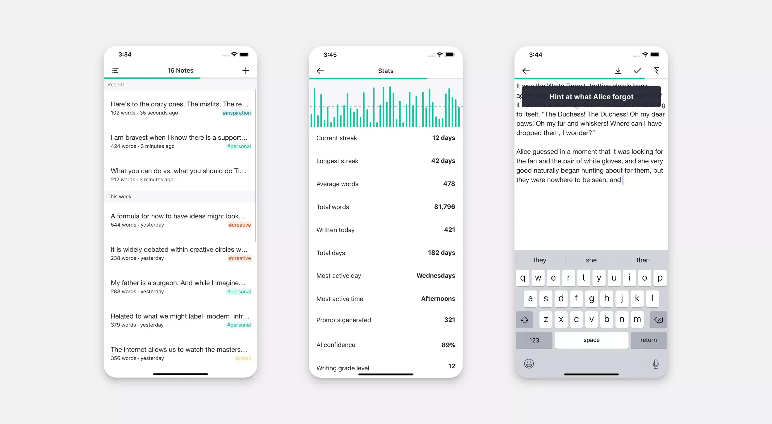
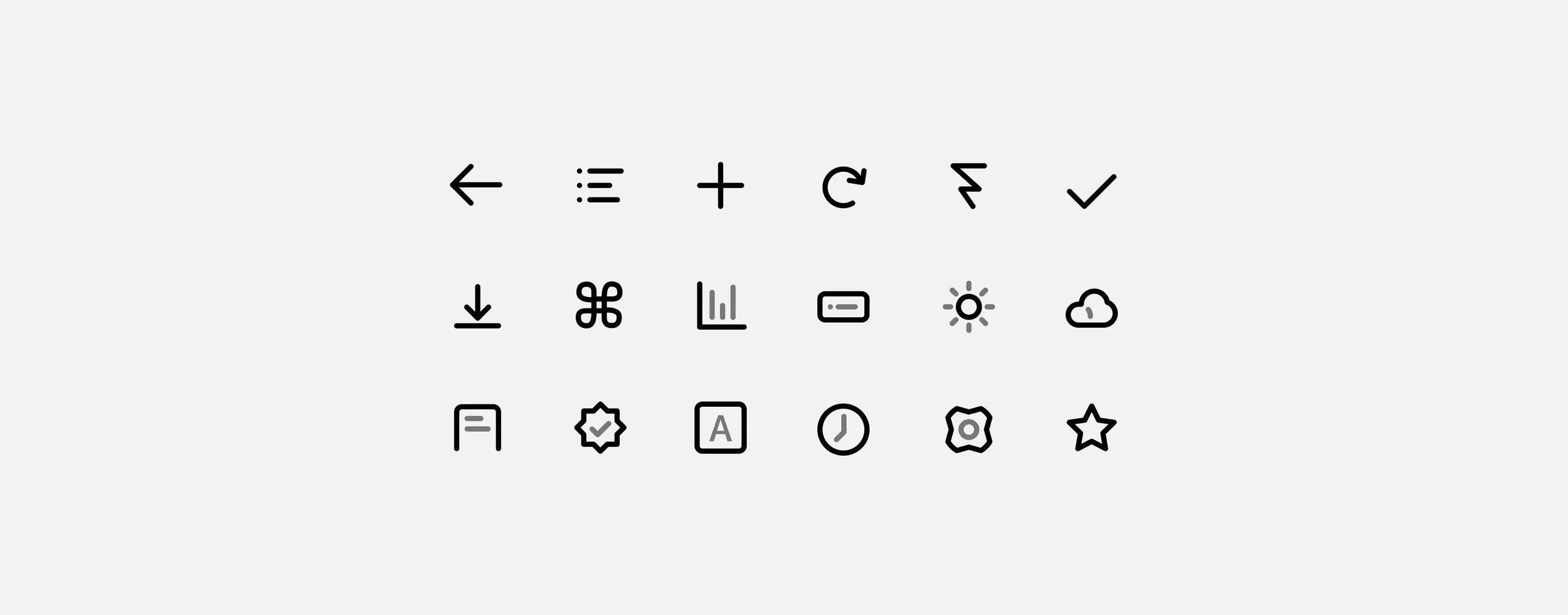
I did not trust the numbers to tell me why. So I built a “Send feedback” button into the app itself, and the feedback arrived in volume. I spent months reading it and talking to customers, and the app changed accordingly: crashes fixed, new kinds of statistics, syncing to Dropbox and later iCloud, hashtags so writers could group notes by theme, and a custom icon library replacing the borrowed one.
The complaints taught me more than the praise. Praise tells you to keep going. Complaints tell you where the design is lying to somebody.
The audience I did not design for
Prompts is now a top Education app worldwide.
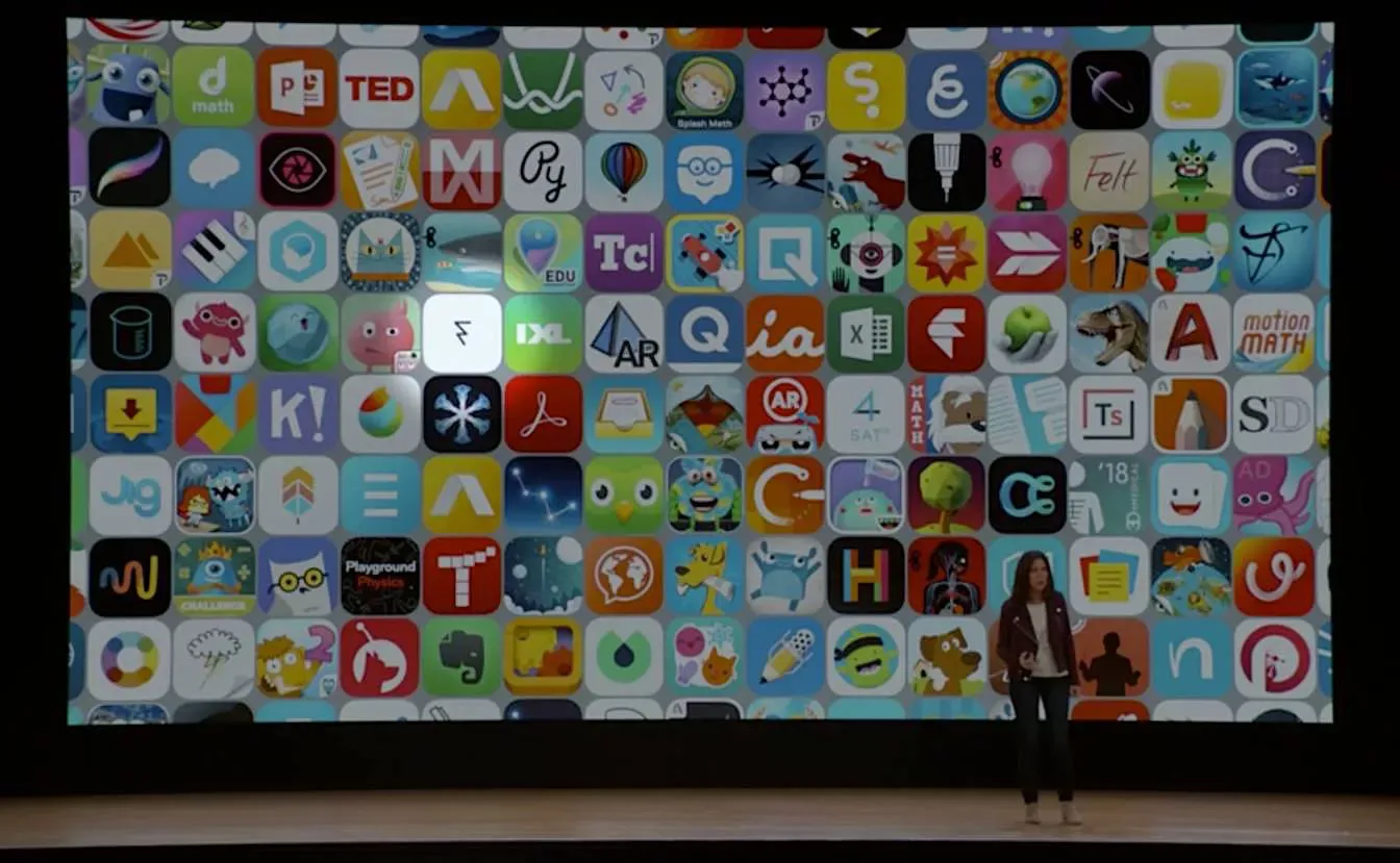
I did not plan that. Teachers found it and brought it into classrooms, and students used it to learn creative writing. Apple has featured it at education events — including one in March 2017 — and in the App Store since.
Educators became my most consistent source of feedback, and they changed how I thought about who the app serves. A student with an assignment due Thursday is not a hobbyist looking for a muse. That writer has a deadline, a topic imposed from outside, and no interest in poetry about the sea. Designing for both of them is harder than designing for either, and the app is better for having been forced into it.
What thirteen years of that feedback actually taught me
Everything below came out of those two sentences from my team, refined by a decade of people telling me where the app failed them. This is the current thinking, built into the newest version.
One: the blank page and the stalled draft are different problems
For eleven years I treated them as one feature. That was my largest design mistake, and it hid in plain sight inside my team’s two complaints.
The writer with an empty page has nothing to react to. Ask what they are avoiding and you add pressure to a situation already made of pressure. Questions need something to be about.
The writer with four paragraphs has the opposite problem. There is material on the page. There is a direction. The writing has stopped anyway. Offer that writer an opening line and you deliver an insult: they began long ago.
So the app now carries two distinct tools. Opening lines for the empty page — 647 of them, in six kinds, and the writer chooses which kinds are in play, because a poetic fragment thrills the memoirist and irritates the student with the Thursday deadline. And questions for the middle, which appear only once there is something to read.
Separating them unlocked everything downstream. While they were one feature, every improvement to one made the other worse.
Two: a question written for everyone fits no one
The first version generated its questions by substitution. Templates held slots — %INPUT% fear, what %CHAR% forgot — and the app dropped a noun from the writer’s page into a slot.
It worked better than it deserved to, because a reader completes a half-formed question without noticing. But it had one failure I could never design around: the app could not tell a writer working through a fight with a parent from a writer outlining a fantasy novel. It handed both of them %INPUT% fear.
The new version reads first. It examines the writing for feeling, for people and places, for whether the writer is arguing with themselves, and sorts the moment into one of ten situations: working through feelings, handling conflict, celebrating, reflecting, exploring, solving, telling a story, sitting in uncertainty, growing, staying present.
Then it chooses from 2,701 questions written by hand for those situations. Each carries a record of how deep it cuts and whether it needs a person or a feeling to make sense. A question that requires a feeling, finding none, scores zero and stays quiet. A vague question is worse than silence.
Three: nobody is stuck in a document, they are stuck in a place
Once an app can read the page, the obvious move is to feed it the whole page. The obvious move is wrong.
The writer whose cursor rests at the end of paragraph nine needs help with paragraph nine. Paragraph two is finished. Read everything and the app asks about the average of the document, and no writer stands at the average of a document.
So it looks where the writer is. Select a passage and it reads around the selection, since selecting text is the plainest statement a person can make of this, here, this part. Leave a cursor and it reads around the cursor. Give it neither and it reads the end, because the end is where the writer last stood.
A hard limit caps what reaches the engine. That limit serves the writing, not the processor. Feed the app everything and it asks about themes. Nobody stalls on themes. Writers stall on the next sentence.
Four: help that interrupts is not help
The finished interaction is small. The writer stalls and taps once. A line of text slides in near the bottom of the window carrying a question. The cursor does not move. The editor does not dim. The question can be flicked away with a finger or ignored until it leaves.
That took the longest of anything to reach, because a prompt interrupts by definition. The writer has asked to be interrupted. So the problem is exact: interrupt the writer without destroying the work the interruption pulls them from.
Every heavier treatment made it worse. A panel shifts the layout, and a shifted layout pulls the eye off the sentence in progress. A dialog demands a decision, so the writer must dispose of the question before returning to work — the precise tax the tap was meant to avoid. A permanent region of the screen fails differently: a thing always present becomes a thing never seen.
Allowing a swipe came late and changed the feel of the app more than its size suggests. Brushing a question aside with your hand spares you from considering it. You refuse it with your body instead of your attention, and the sentence survives.
Five: the wrong tone at a vulnerable moment ends the session
The first version had one voice, and that voice was clever. Clever serves the writer brainstorming a plot. Clever wounds the writer working through something that hurts.
So the app now chooses a register as well as a subject: gentle, neutral, or probing. The same situation yields different questions.
Gentle: What tenderness can you offer yourself right now?
Probing: What old wound does this touch?
Both are good questions. Only one is safe at 6 a.m. on a bad morning. Gentle questions are permitted to be soft to the edge of not being questions, because sometimes a writer needs company rather than examination. An app that only ever pushes is an app people abandon on the days they most need it.
Six: a tool that writes for you is not a writing tool
By 2025 an easier path existed and would have taken an afternoon. Send the writing to a model, receive a better question.
I built the engine by hand instead, for two reasons, and privacy was not one of them.
The first is a product argument I still hold. The moment a tool can produce your sentence, that is what it gets used for. Not because anyone decides so, but because the easier path wins by default, and the writer stops developing. Everything of value here depends on the person producing the words.
The second is craft, and it is more selfish. I wanted to build the intelligence rather than rent it. Calling an API would have solved the problem and taught me nothing.
One consequence follows from both: nothing leaves the device. No account, no server, no network request of any kind. I benefit from that less than my users do, since I am not the one writing confessions into it — but a student, or a person keeping a private journal, never has to take my word for anything.
Seven: I cannot tell which questions work
The first version had one measure of a good question. I liked it.
The new one watches what happens next. Did the writer start typing? Did they ask for another question at once? Did they mark it poor? Each question earns a score from behavior and forms no opinion until it has been seen at least three times. A second layer learns which kinds of question suit a particular writer.
I never see any of it. It stays on the device. I built a system whose most valuable findings can never reach me, which is the opposite of how I built the first version.
Eight: reminders that shame people make them quit
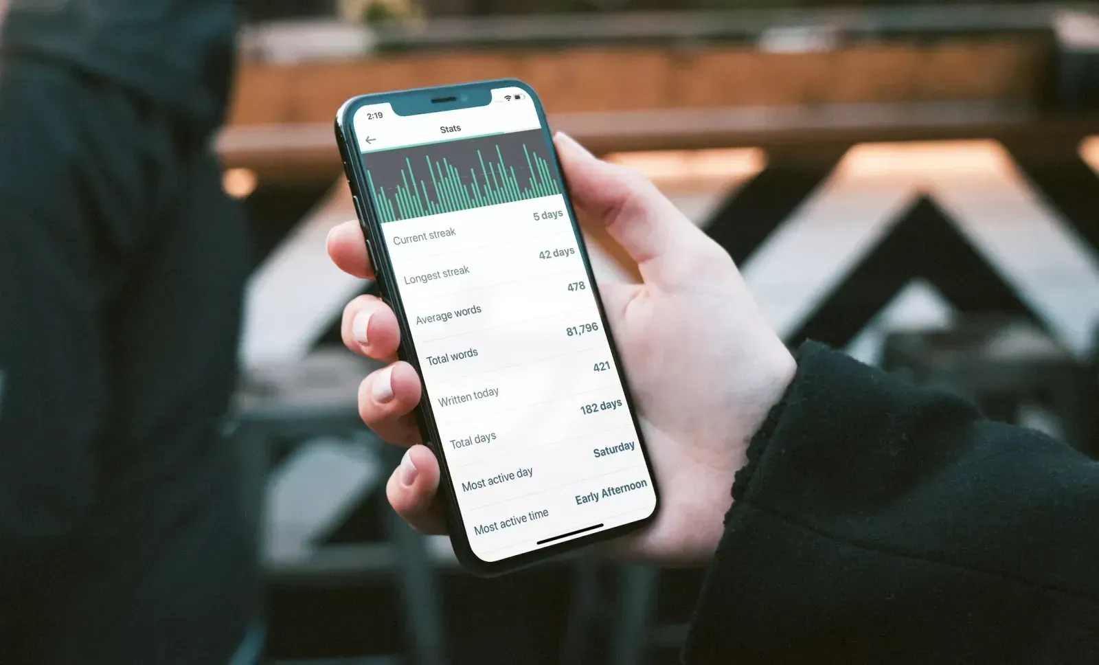
Every writing app eventually builds a streak, and every streak eventually punishes somebody for having a hard week.
The reminders here ask for the smallest possible thing: Write a word. Write for a minute. Start a paragraph. None mentions how long it has been. None counts anything. Each carries a snooze.
A reminder should lower the cost of returning. The moment it raises the cost of having been away, it has begun teaching people to avoid the app.
Rebuilding it
The original ran for years and then stopped. The code had beaten me — a 2,700-line view controller and a decade of shortcuts made every change expensive — and life took the hours, and it faded without my ever deciding to stop.
I rebuilt it in late 2025, when the tools had matured enough for one codebase to be a good Mac app and a good iPhone app, and when I went looking for the thing that used to help me and found only my own broken version of it.
The rebuild is the least interesting part of this story. The problem never changed. Only my understanding of it did.
What I got wrong
I conflated the two problems for eleven years. My team told me the answer in 2013, in two sentences, and I built one feature out of them anyway. It took a decade of user feedback to hear what I had already been told.
I turned my indecisions into settings. Fonts, themes, categories, reminders, goals. Each toggle marks a place where I could not choose and handed the choice to the writer. A better version asks fewer questions of the person who came here to be asked questions.
I trusted my own taste too long. The feedback button was the best thing I ever built into that app, and I built it after launch rather than before.
Where it stands
The original is still out there and still serving students and teachers. The new version ships shortly.
One honest note to end on, since this is a portfolio and not an advertisement. I have faith in the app. I have less faith in the engine inside it. Building that engine before modern models existed was genuinely energizing and I would not trade the work, but those models have surpassed what I can construct alone, and I know it. If I return to this app, it will be to adopt them.
That is not a reversal. A tool that writes your sentences is still not a writing tool, and I would use a model exactly as I used my own engine: to ask a better question, then get out of the way.
Thirteen years ago two writers on my team told me they got stuck after the first line. Everything since has been an attempt to answer them properly.